
提携サイトの注目記事




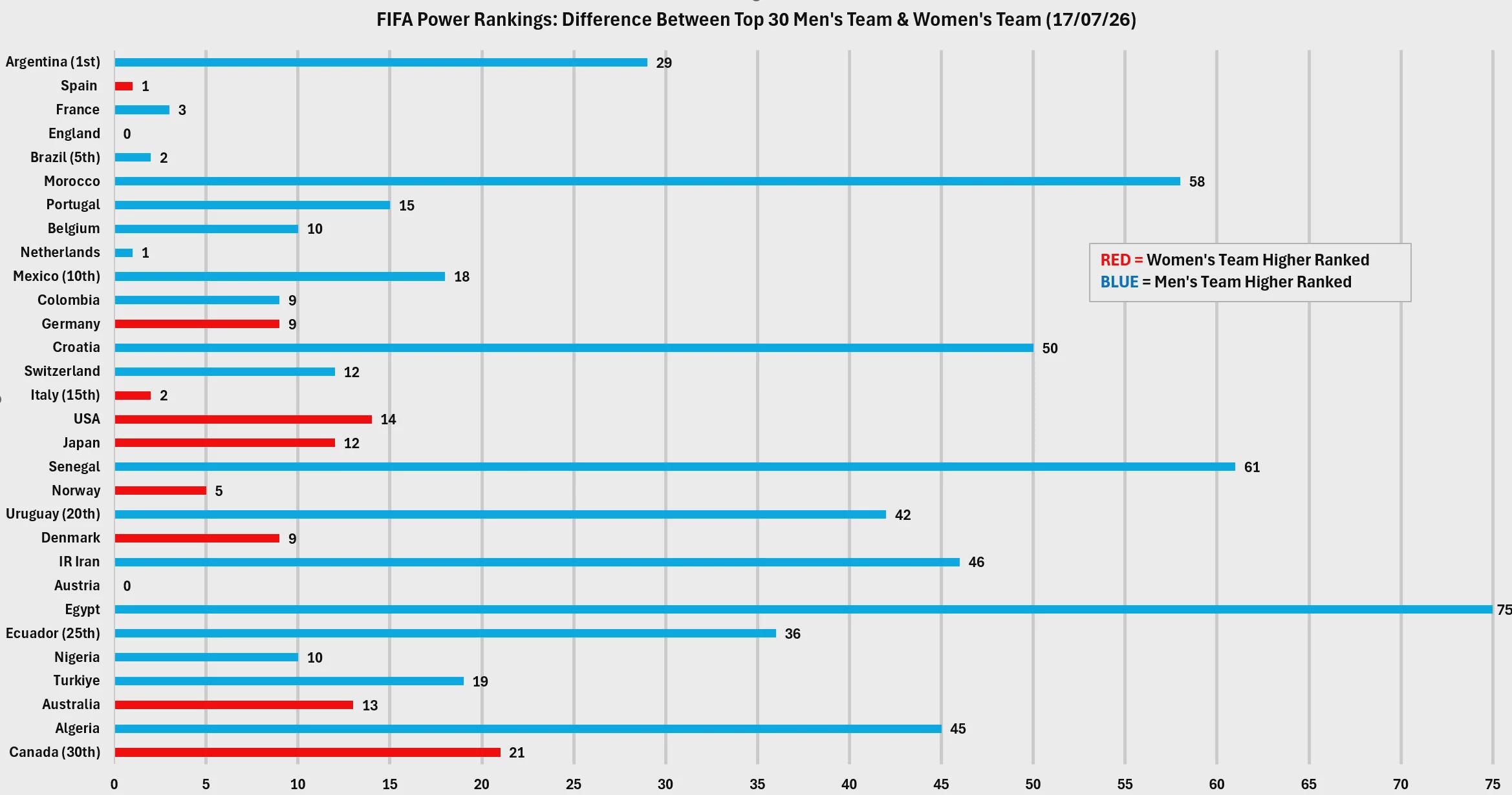
男子と女子のナショナルチームにおけるFIFAランキングの乖離を可視化したグラフが投稿され話題を集めています。しかし、その独特すぎる構成に「理解するのが難しすぎる」と困惑やツッコミの声が相次ぐ事態に。海外ファンの様々な反応をさっそく見ていきましょう!
以下、海外の反応
2列のグラフで順位を見せることが目的じゃなくて、代表チーム間の格差を測ることが目的だったんだ。変数は2〜3個だけで、Y軸が男子代表ランク(1〜30位)、X軸が男女の順位の絶対差、色の凡例はどちらのランクが高いかを表してる。
Dual column graph with the placements wasn't the goal. Measuring disparity between national teams was. There's only 2-3 variables Y axis: men's team ranking 1-30 X axis: absolute difference men and women's team ranking Colour legend: which team is ranked higher
でも女子オーストラリア代表って、男子のU-15チームに7-0とかで負けてなかったっけw
Didn't they lose like 7-0 against a U15 boys team though
うわ、このグラフ理解するのめちゃくちゃ難解だったけど、やっと意味が分かったわ。
Wow it was HARD to get the graph but I get it now
なんて分かりづらいグラフなんだ!
What a confussing graph!
これについて説明するね。フィードバックは嬉しいけど、具体的にどこが混乱する?女子サッカーの掲示板では問題なく読めてたよ。X軸にラベルを付けるべきだったという批判はもっともだし、タイトルから分かると思ってた僕が間違えてた。本文では説明したんだけどね。上から下が男子の順位(1位アルゼンチン〜30位カナダ)で、X軸は男女チームの順位差なんだ。例えばフランスは男子3位で女子は...
Going to address this. Am happy for feedback but what's confusing about this in particular? r/womenssoccer had no issues reading it. A valid criticism is I should've labelled the X axis but I thought this was given from the title. I was wrong. I did explain in the body text though. Reading top to bottom is Argentina 1st mens ranking and bottom is Canada 30th mens ranking. The X axis is the absolute difference in places between the men's team and the women's team. I.e France is 3rd and their wome…
やっと意味が分かった!あぁ自分がバカに思えるよ、マジで理解できてなかった。グラフとしてもっと直感的で明快にする方法があるかは分からないけど、絶対にやり方はあるはず。何はともあれ共有してくれてありがとう、読み方が分かるとすごく面白いね!
I understand it now! Oh my I feel so dumb, I really didn't get it. I'm not sure how it would be more obvious and intuitive as a graph though but I'm sure there's a way. Thanks for sharing regardless, it's very interesting now that I know how to read it.
これって資金面の違いなのかな?それとも一部の国が女子サッカー選手のためにより適切なリーグや練習環境を提供してるってこと?
Is it about funding? Or do some of the countries provide more proper league/training for women football players?
資金、文化、リーグ、栄養面とか色々あるけど、専門家じゃないから僕からはコメントできないな。ただデータを共有したかっただけなんだ 🙂
Funding, culture, leagues, nutrition all things I can't comment on since I'm no expert but just here to share the data 🙂
全ては投資次第だよ。2019年当時、スペインは女子チームにほぼ資金を割いてなかったから強くなかった。それが控えめな投資改善によって、弱いチームから世界トップクラスへと変貌を遂げたんだ。放映権契約も獲得できて自立し始めたしね。
It's all about investment: In 2019, Spain basically dedicated no money to the team, and thus, the team was no good. A relatively modest improvement turned a pretty bad team into one of the best in the world. One that could get a TV deal, and therefore start to pay for itself a little
マジかよスペイン女子代表は男子代表の2倍素晴らしいな。デ・ラ・フエンテ監督には絶対無理だわ。
Damn Spain women's team is twice as good as men's team. De La Fuente could never
欧州勢の中でクロアチアは興味深い外れ値だな。
Croatia is an interesting outlier among the Europeans
なんでみんなこのグラフ読むのに苦戦してんの?全員頭悪いの?
how are people struggling with reading this graph. are you all stupid?
いや、悪いのはグラフの方だろ。読みづらいからじゃなくて、最初はもっと単純な図を期待してるのに投稿者の無駄な独創性に混乱させられるから、無駄に複雑になってるんだよ。
No, the graph is. It is unnecessarily complicated, not because it's hard to read, but because you initially expect much simpler representation, but are confused by the extent of OP's creativity.
情報を伝えるフォーマットとして酷いと思うだけじゃなくて、この情報の使い道すらサッパリ見当たらないよ。
Not only do i think this format to communicate the information is terrible, i struggle to find any applicable uses for this information.
国際ランキングで男女が同等なチーム(イングランド、スペイン、オーストリア、オランダ等)と、かけ離れているチームを示すためだよ。ただそれだけ。政治も意図も陰謀もなくて、ただこれだけなんだ 🙂
Just to show the teams which have both an equal men's and women's team in terms of international ranking (England, Spain, Austria, Netherlands etc) and the teams which aren't close. That's all. No politics, no agenda, no conspiracy just this 🙂
正直あまり役に立たないよね。自国同士の比較にしか使えない。もしある国が男女とも128位で、イングランドが男女とも4位だった場合、このグラフ上では両国ともまったく同じ見た目になっちゃうから。
Is a bit useless really, is just useful to compare each country against itself, because it shows the difference of itself. If a country has both teams in the 128 position and England has the both teams on the 4 position both countries would look the same in the graph.
それをやると、さらに98チームも載せる必要が出てくるから、めちゃくちゃ巨大で解読不能なグラフになっちゃうよ。
That would be a very very very big and unreadable graph, since it would need 98 more teams listed
この記事をシェアする
 英国人「もの凄いわ」鈴木彩艶、神セーブ!アストンヴィラは惜敗も現地サポから称賛続出!【海外の反応】海外の反応アンテナ
 英国人「日本代表入りあるぞ」松木玖生、左足一閃でゴール!大勝に貢献で現地サポ絶賛!【海外の反応】海外の反応アンテナ
 【海外の反応】ドジャース投手陣のランク表をミーム画像で作ってみた「これはめっちゃ面白い」海外の反応アンテナ
 英国人「上手すぎる」鎌田大地、圧巻2アシスト!冨安健洋がゴールの起点に!現地サポから称賛殺到!【海外の反応】海外の反応アンテナ
 海外「スカウトに感謝!」鈴木彩艶が負け試合でも輝きを放ち海外大興奮!(海外の反応)海外の反応アンテナ
 ラグビー日本代表がアメリカ戦で決めたトライに世界が騒然!←「彼らは日本人なの?」(海外の反応)海外の反応アンテナ
これ最高だけど、男子と女子の順位を2列並べたグラフだったらもっと良かったな。どこかにそういうチャート版はない?あと個人的には、マチルダス(女子豪州代表)の方がサッカールー(男子豪州代表)より1000%マシだと思うから、この差には驚かないや。ごめんねw
Love this, but wish it was a dual column graph with the placements of the men and women’s team. Is that chart version available anywhere? Also, the Matildas are 1000% better than the Socceroos IMHO so I’m not surprised by the difference - sorry not sorry!